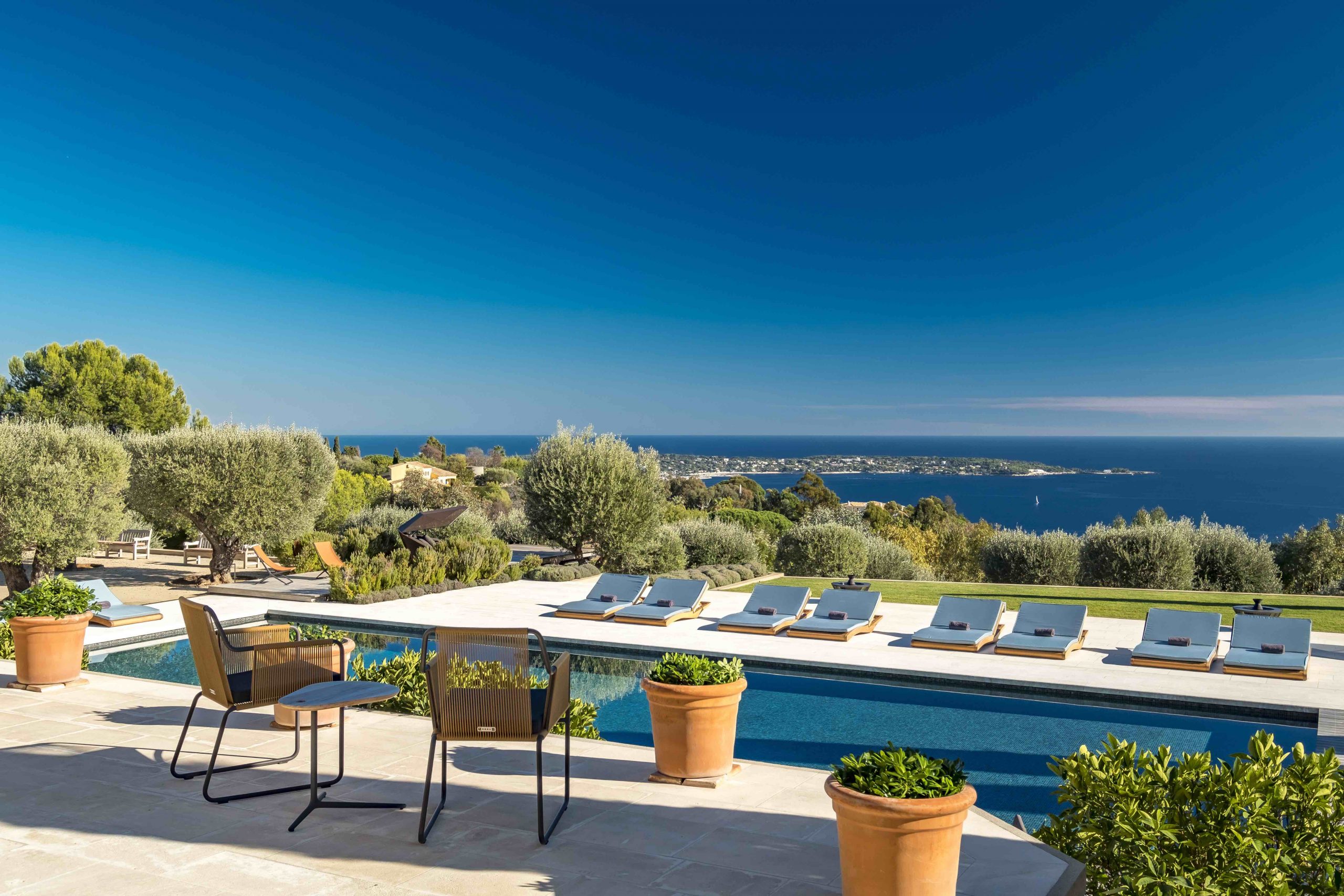
We were asked to create a piece of collateral that agents could supply to purchasers and sellers that would celebrate and highlight both the local knowledge of the Knight Frank team in the South of France as well as the communicating the benefit of the global Knight Frank brand. As well as editing and creating new content for the brochure, which was then translated into French, we helped to strategise and determine the most appropriate key messages to be used in the collateral. We focussed on image led design to showcase the amazing properties and locations. The brand style was embellished with thin keylines, delicate typography and semi-transparent blocks to let the images shine. The result was a quality piece of literature used to leave with both homeowners and potential purchasers.
